|
|
Post by EmperorG on Mar 6, 2004 22:41:29 GMT -5
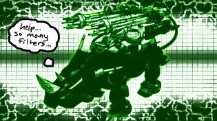
the title says it all
|
|
Raven
Captain
 Join my RPG http://zdft.proboards18.com/index.cgi
Posts: 442
|
Post by Raven on Mar 7, 2004 17:26:53 GMT -5
|
|
legoliger
Captain
weeeeeeeeeeeeeeeeeee i have shiny and spikey wrist bands
Posts: 449
|
Post by legoliger on Mar 7, 2004 21:15:55 GMT -5
it's good but i perfer real models
|
|
|
|
Post by Deadborder on Mar 8, 2004 17:09:16 GMT -5
No.
Not in the slightest.
Rick R.
|
|
|
|
Post by ADRFury on Mar 8, 2004 19:29:08 GMT -5
Actually, if you look at the burning zoids icons thread, i've made a perfectly better one. Why it is better, in my opinion, is because yours has this problem-
A bad CPC.
Why it is bad, is that rather than being a) a large, light colored blast that takes up the majority of the area in from of it -or- b) a straight, airbrush of blue/purple with yellow/white going down the middle, which, in my opinion, pulls off a realistic CPC, even if you have to resort to using paint, resembling those from CC/GF and NC/0.
Don't take it personally. Just some constructive criticism.
|
|
|
|
Post by EmperorG on Mar 8, 2004 20:39:56 GMT -5
jeez guys cut me some slack,all i got is paint and im just 11
|
|
|
|
Post by ADRFury on Mar 8, 2004 20:42:43 GMT -5
Just to point out, BladeLiger is only eleven, and he's created awesome headless zoids!
|
|
|
|
Post by Saix on Mar 8, 2004 23:07:03 GMT -5
hey emperor, you asked for our opinion...
also, blending all those colors was kinda sloppy, but you can always "make custom colors" and make lighter shades of a certain color, and darker shades of a certain color...and white in the middle!!! (paint)
its a suggestion...just trying to be of help...or not...whatever ;D
|
|
|
|
Post by Phenotype on Mar 9, 2004 14:01:12 GMT -5
jeez guys cut me some slack,all i got is paint and im just 11 If you don't like what people have to say then don't ask for their opinions. -Phenotype |
|
|
|
Post by Quatre on Mar 9, 2004 14:05:18 GMT -5
eh, 50/50. Its not a bad peice of work but i have to give it some down for a few things (dont like color red, cant see head well, cpc doesnt look right, dont like the thing yopu recolored or whateva) but i did the same thing for the contest. have to judge by quality of the work, not personal things/...
|
|
|
|
Post by ADRFury on Mar 9, 2004 21:10:32 GMT -5
Cool! You got a new sig! It's better, now! Much more pleasing to the eye than the other thing.
|
|
|
|
Post by Quatre on Mar 9, 2004 21:18:45 GMT -5
Cool! You got a new sig! It's better, now! Much more pleasing to the eye than the other thing. indeed |
|
Ferrariferg
Captain
Concept ZOIDS are the best!!!!!!!!!!!!!!!
Posts: 415
|
Post by Ferrariferg on Mar 10, 2004 0:07:21 GMT -5
i like it.
|
|
|
|
Post by cobski on Mar 10, 2004 18:36:54 GMT -5
It isn't terrible. The red horn could use some touching up, though.
|
|
|
|
Post by EmperorG on Mar 10, 2004 19:58:41 GMT -5
It isn't terrible. The red horn could use some touching up, though. what red horn?its a gojulas mariner |
|


 Stare in envy at my chibi ADRSaurer *watches bounce the name up and down*