Post by zed on Oct 11, 2006 10:22:18 GMT -5
So here we have my first ever venture into buying 20 year old plastic. How did I get on ?
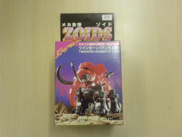
Here is the box front. I must confess, I was astonished by how good it was. The darn thing is 20 years old and looks better than most of the boxes you'd pull off the shelf at Toys R Us.
== THIS BOX NEEDS A HOME ==
I don't collect boxes, and in a week or two I'll manage to accidentally sit on it or spill coffee over it. If anyone wants it, let me know. Please Adopt-a-Box and save it from a life of abuse and neglect.
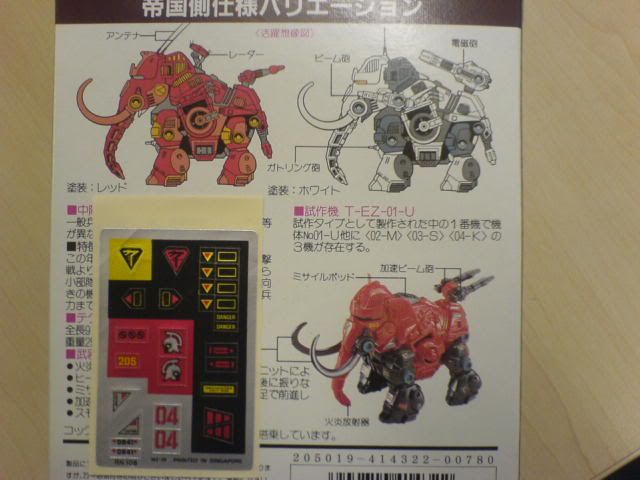
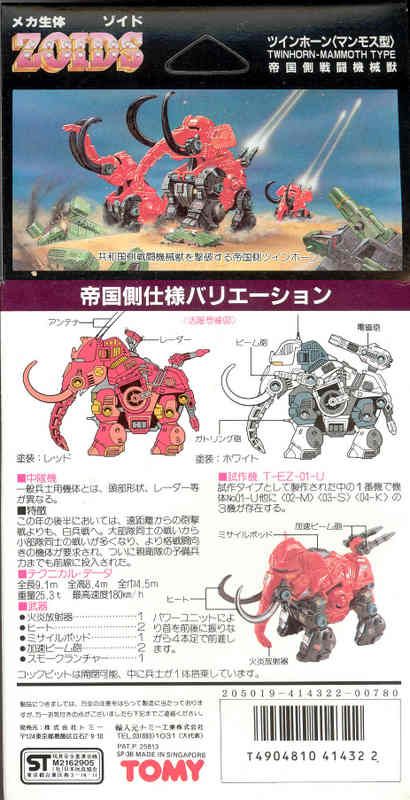
Many of the OJR boxes came with alternate colour schemes, and non-existant weapon options. Personally, I think the Artic camo scheme best. Also, TwinHorn came with foil stickers, and a rather unique Gladiator logo.
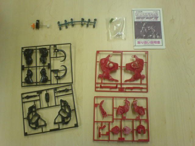
Not many bits, just four sprues in two colours. And the infamous teal caps.
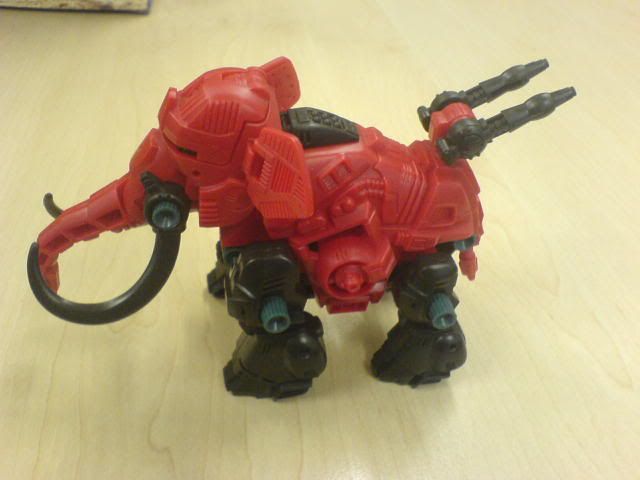
Ready for action !
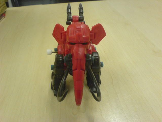
How do you stop an elephant charging ? Take away his credit card !
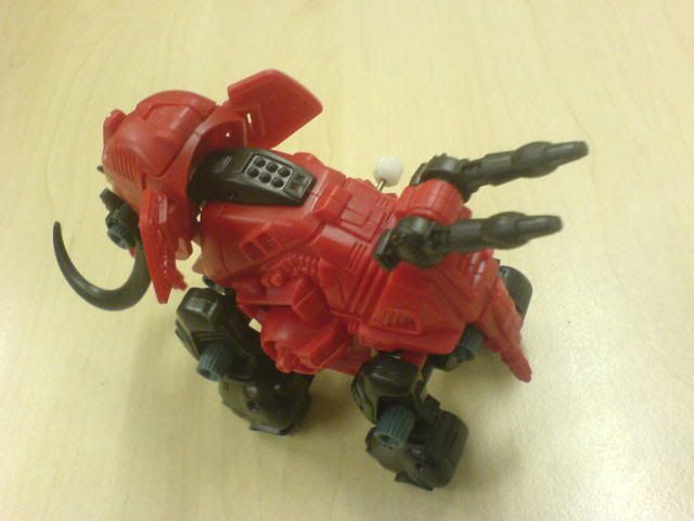
Detail of the back area.
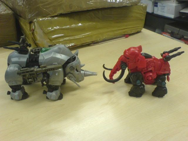
Mammoth takes on his natural enemy the wooly rhino - Size comparison shot. So he's not that big.
Construction:
Being a small, 20 year old kit, its pretty simple and quick to build. I did find the plastic a little bit harder then modern kits, and tended to get white stress marks more easily. Don't know if this is due to different quality plastic being used back then, or the plastic aging and becoming a bit more brittle.
The Good:
The heavily armoured design is great, with lots of detail. You can see where the design for Elephander came from. Full of vents, panels, and I particularly like the round things on the sides. No idea what they are, but they look dead cool. TwinHorn is quite a small Zoid, but the design looks like he'd be dangerous in close combat.
I also really like the unique stickers, but it is a shame they are on foil, rather than the usual transparent backing. I won't use them for now, but may try to scan and print them onto transparent labels.
As well as walking, the head bobs up and down, which is a nice touch.
The Bad:
By modern standards, the mechanics are pretty basic. He walks, and he nods. The trunk is one solid piece, which moves at the joint to the head. The ears and rear guns are posable.
Also, there are few parts. In a modern Zoid, I'd expect more seperate armour parts on top of a base structure, such as on the legs and ankles. The red-body-with-solid-brown-legs does make Twin Horn look pretty un-interesting at first glance, until you see the molded details.
The Ugly:
The colour. Orangey-red body, dark brown legs and teal caps ? Some people find it an aquired taste, but I think its just grim. I may try a caps swap, or maybe I can convince Lionel to re-paint him in classic red and silver. I'm actually tempted to copy the Artic paint scheme from the back of the box ...
Overall - I'm glad I picked him up. I'm not tempted to go out and track down every OJR/OER Release, cos I don't have the money or patience. But how can you not love this little, fat ball of mechanical death ? Next I must find a Sea Panther ...
zed

Here is the box front. I must confess, I was astonished by how good it was. The darn thing is 20 years old and looks better than most of the boxes you'd pull off the shelf at Toys R Us.
== THIS BOX NEEDS A HOME ==
I don't collect boxes, and in a week or two I'll manage to accidentally sit on it or spill coffee over it. If anyone wants it, let me know. Please Adopt-a-Box and save it from a life of abuse and neglect.


Many of the OJR boxes came with alternate colour schemes, and non-existant weapon options. Personally, I think the Artic camo scheme best. Also, TwinHorn came with foil stickers, and a rather unique Gladiator logo.

Not many bits, just four sprues in two colours. And the infamous teal caps.

Ready for action !

How do you stop an elephant charging ? Take away his credit card !

Detail of the back area.

Mammoth takes on his natural enemy the wooly rhino - Size comparison shot. So he's not that big.
Construction:
Being a small, 20 year old kit, its pretty simple and quick to build. I did find the plastic a little bit harder then modern kits, and tended to get white stress marks more easily. Don't know if this is due to different quality plastic being used back then, or the plastic aging and becoming a bit more brittle.
The Good:
The heavily armoured design is great, with lots of detail. You can see where the design for Elephander came from. Full of vents, panels, and I particularly like the round things on the sides. No idea what they are, but they look dead cool. TwinHorn is quite a small Zoid, but the design looks like he'd be dangerous in close combat.
I also really like the unique stickers, but it is a shame they are on foil, rather than the usual transparent backing. I won't use them for now, but may try to scan and print them onto transparent labels.
As well as walking, the head bobs up and down, which is a nice touch.
The Bad:
By modern standards, the mechanics are pretty basic. He walks, and he nods. The trunk is one solid piece, which moves at the joint to the head. The ears and rear guns are posable.
Also, there are few parts. In a modern Zoid, I'd expect more seperate armour parts on top of a base structure, such as on the legs and ankles. The red-body-with-solid-brown-legs does make Twin Horn look pretty un-interesting at first glance, until you see the molded details.
The Ugly:
The colour. Orangey-red body, dark brown legs and teal caps ? Some people find it an aquired taste, but I think its just grim. I may try a caps swap, or maybe I can convince Lionel to re-paint him in classic red and silver. I'm actually tempted to copy the Artic paint scheme from the back of the box ...
Overall - I'm glad I picked him up. I'm not tempted to go out and track down every OJR/OER Release, cos I don't have the money or patience. But how can you not love this little, fat ball of mechanical death ? Next I must find a Sea Panther ...
zed


