|
|
Post by Wolfy on Dec 22, 2004 19:40:46 GMT -5
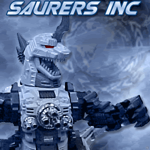
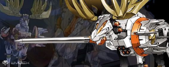
Is that a shield liger with Nataku for a head?
|
|
|
|
Post by ROss on Dec 23, 2004 7:45:59 GMT -5
well ther is not really much more to tell all i done was add more detail , to te pic rounding out the shapes, then i fliped the sheet over and rendered it n, thats all, and i've said that already. all i could add would be to work from the top left to the bottom right of the page ( top right to bottom left if you are a lefty) that way it won't smudge to badly. and that to render on the reverse you should render the higights then do the mid tones thwen the shadows, as if you start shadows first then the others wont come through, you may also want to do som light shading on the front/ detail side,to bring out som of the details further. I may perhaps do some thing in colour as part of a colouring tutorial but that i'll probs be in the new year. perhaps I may even hold out till i got my mad Thunder and do that. ;D oh yeah WOlphy its actually a sheildy with altron dragon heads graphted onto epyons legs for a head. is there should be pics of the model on my photo bucket. its um possibly  JAff |
|
|
|
Post by KairuHakubi on Dec 23, 2004 13:00:03 GMT -5
i thought those were epyon parts... <.< i just had no idea there was an actual model to go with that picture so i didn't make the connection ^^'
*shamelessly plugs own site again*
|
|
skatemonkey89
Captain
 life for you has been less than kind, so take a number, stand in line
Posts: 597
|
Post by skatemonkey89 on Dec 26, 2004 2:31:37 GMT -5
B E A UUUUUUUUTEEEFUUUULLLLLLLL sketch man. i wish i was that good.  |
|
|
|
Post by Wolfy on Dec 28, 2004 7:40:24 GMT -5
aahhh, fancy custom. Anyways, One of my friends who draws the webcomics with me, he can sit down think of a picture, then it will come out like a frikken photograph. It's scary. He skips all that and goes directly to the last step. I have to go through it step by step and it still ends up looking mediocre.
|
|
|
|
Post by ROss on Dec 28, 2004 9:49:00 GMT -5
in general i just skip the first few steps two and go straight for the gold, but doing the steps is a good method for those who are just developing their skills, and helps them to gain more confidencs then eventually they'll drop step one, then as they get better they'll slide straight into step 3. THis tutorial is just to give the artists a good beginners woring method which they can then customise or personalise to their own working style.
oh and KairuHakubi i said in the intro that it was a pic of a custom i done, and i also mentioned that i had the zoid right in front of me so- tisk tisk who wasn't paying attention
|
|
|
|
Post by KairuHakubi on Dec 28, 2004 13:09:14 GMT -5
yep, i do that. course you also asked me to show you my art to prove i knew what i was talking about and i put a link.. and so far nobody's noticed.. so maybe we all don't pay attention ^_^ course now i hear you aren't supposed to link to your site, so.. XD
|
|
|
|
Post by Silverliger on Dec 29, 2004 12:30:07 GMT -5
That is awesome!!!!! And I'm a year older than you, but you draw WAY better than I do at zoids.  |
|
Wyvex Executor
Corporal
 LOOKIE........... ITS A BULLFROG!!!
Posts: 159 
|
Post by Wyvex Executor on Jan 1, 2005 5:46:44 GMT -5
Hi Ok well last time I said that I’d post this so here it is. (By the way I’m not the best at explaining things so you’ll have to bear with me) I’ve tried to list all these little tips in detail, to the best of my knowledge. Some of this might or might not be elementary knowledge to some people, I don’t know but if you want me to explain something in detail then just ask. For this topic/section I’ll be using Derwent Watercolour pencils and Derwent Artists pencils. Just quickly, Artists – the pigment strip within is thicker, and is mixed with wax witch enables easy blending. - They have a high level of opacity that makes superimposing and highlighting easy and allows the pigment to stay the same/true even on coloured paper. Watercolour- can be used wet or dry, and if you know what your doing they can create a whole host of different artistic effects. COLOURING AND TONING USING PENCILS - When colouring in any drawings its best to lightly trace the image onto a clean piece of paper (a H is best for this), colour and then outline with a felt-tip pen if you want to. This also gets rid of those annoying ‘white lines/indents’ created through the sketching/drawing process.  Another benefit of transferring your work onto a new bit of paper is that when you colour your finished image, you wont have to worry to much about the colour pigment smudging the lead, as there wont be copious amounts of lead on the paper.  - If you’re going to tone your picture then decide on a ‘point of light’ and stick to it. Basically if the light source is going to be coming from the top left hand corner of the page then just lightly stick a bit of masking tape there so you don’t forget. Your artwork will look a bit strange if it has ½ a dozen different points of light. - Toning; it’s always best to 3 colours for toning. Say for example you use blue, and then you should use a light blue, a standard blue and then a slightly darker shade of blue. You could use white as your lighter colour, but not black it’s to ‘powerful’ and it’ll give a bad result. Just remember to work the colours into each other.  - If you do use watercolour pencils then you can also use a different method of toning. Just lightly blend the colours into each other and let the water do the hard work for you.  Using one colour for tone. Using 3 colours for tone. - Don’t drop your pencils. I know it sounds stupid, but when their dropped or shaken around the centre/ pigment can crack or shatter, which is a massive pain the a**, as its hard to sharpen them and it creates a lot of waste. - Once you’ve finished work it’s a good idea to spray it with some work fixative, or alternatively hair spray. This will reduce smudging and preserve the colour for longer. - Also through the use of toning the perspective/ depth of a picture can be altered and/or enhanced, but keep in mind that creating shadow is a different thing altogether, but it still can be used to create depth and realism to your artwork. Since it’s a bit difficult to explain I’ll post it next time. But hopefully those lil titbits of artistic information are useful to some of you out there. If not. Oh well it happens. Happy New Year. Wyvex |
|
Zoidaholic
Sergeant
can't sleep monkeys will eat me
Posts: 212
|
Post by Zoidaholic on Jan 14, 2005 20:10:22 GMT -5
 i need to practise more before i can get that good By the way great pic
|
|
|
|
Post by Tsukaza12 on Jan 27, 2005 0:54:20 GMT -5
Yo like did u learn to draw like that jaff? man I want to like go crazy. i try like 10 times litterally and i can never even draw 1 thousanth of it at all man.
|
|
|
|
Post by Vig on Mar 27, 2005 0:29:28 GMT -5
Jaffs drawings are too damm good, I kept scrolling past his signature without actually looking at it and thought there was an actual pic of bit cloud until I took notice and realised it was a drawing,if thats your work in your sig jaff,nice
|
|
|
|
Post by ROss on Mar 27, 2005 9:34:53 GMT -5
in general i use all my own work i don't like using some one elses, unless its exactly what is required. Its a matter of principle.
|
|
Juno
Major
 Juno the numero uno
Posts: 941
|
Post by Juno on May 19, 2005 3:40:05 GMT -5
Hey Jaff(or anyone in the forum), do you have any tips and tricks on coloring drawings on the computer? It would really help me a lot cause I'm starting to scan my drawings on the comp and experimenting with photoshop 7.
thanks in advance,
~Juno~
|
|
Jacen Kincaid
Sergeant
Back from the dead it seams. Can't forget Zoids!
Posts: 221
|
Post by Jacen Kincaid on Aug 2, 2005 15:49:45 GMT -5
I have always wished I could draw like that, but alas, all I have is to drool over the art of others.
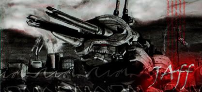
Your basic pic (the third one) is great JAff
|
|


 i need to practise more before i can get that good